
Website refresh for a mobile marketing company

Understanding Cellcast's audience
Cellcast is a B2B mobile marketing platform serving small business owners requiring an affordable, self-managed alternative to hiring a marketing agency. The site had launched in 2017 as a single long-scroll homepage that hadn't been revisited since, despite the business evolving considerably in that time.
In 2023, Cellcast undertook a broader brand refresh, updating its logo and shifting its visual identity to differentiate from competitors and the website needed to catch up with that shift. Three main concerns with the existing website were: SEO performance, poor mobile usability, and a lack of visual consistency undercutting the platform's credibility.
There was also a strategic audience question to answer. Cellcast's existing customer base skewed 35 to 65 business owners managing marketing out of necessity rather than expertise. The business wanted to expand that reach to a younger segment, 25 to 40, often marketing managers at larger organisations, without alienating the customers who'd built the business to that point.
Getting under the surface
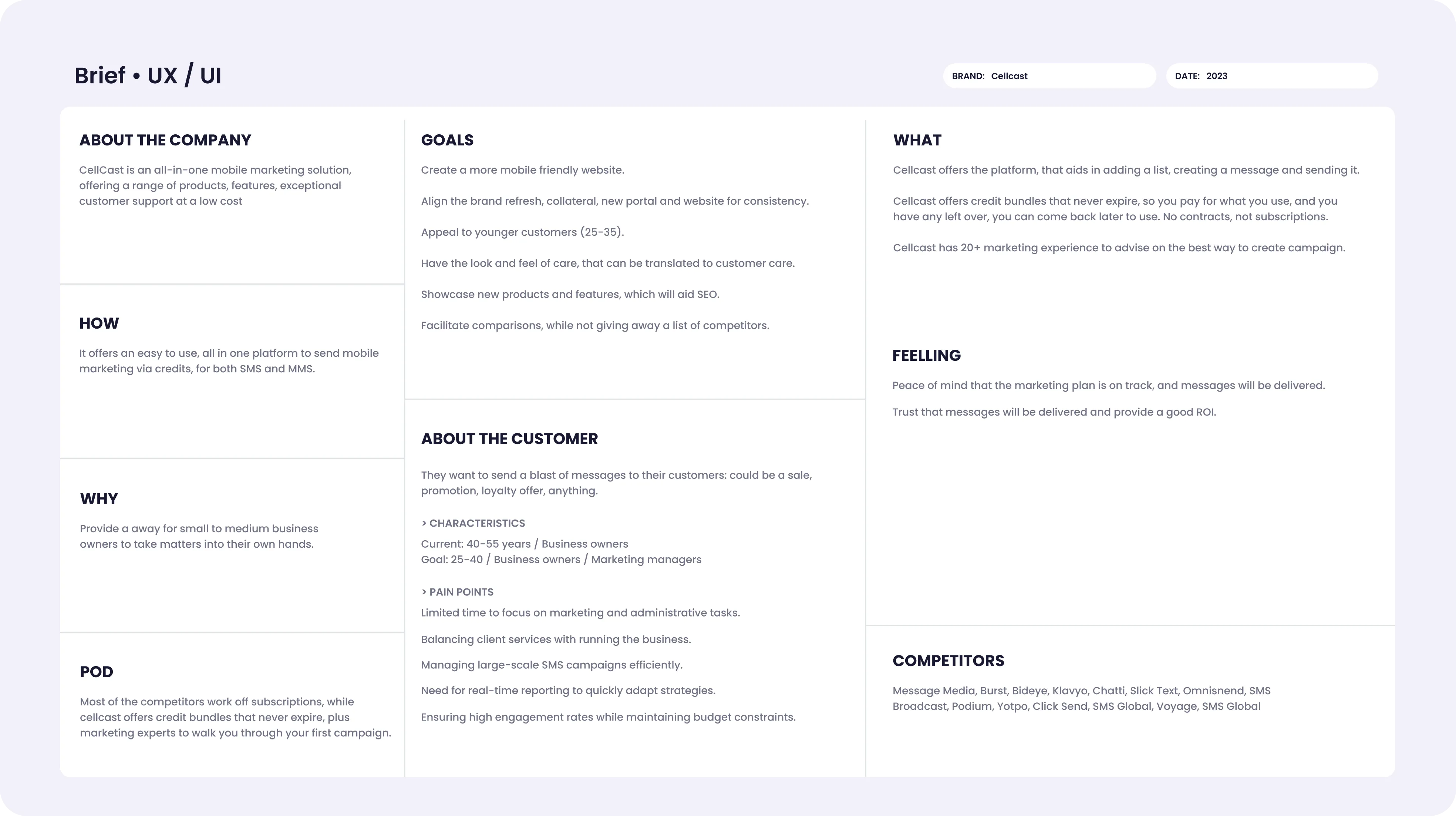
Research combined stakeholder interviews, heatmap and scroll analysis on the existing site, and a competitor analysis across the Australian and US markets. This involved reviewing benchmarking pricing structures, information architecture, tone of voice and feature positioning.
Firstly, I led a stakeholder workshop to uncover core values, brand aspirations, and positioning challenges.
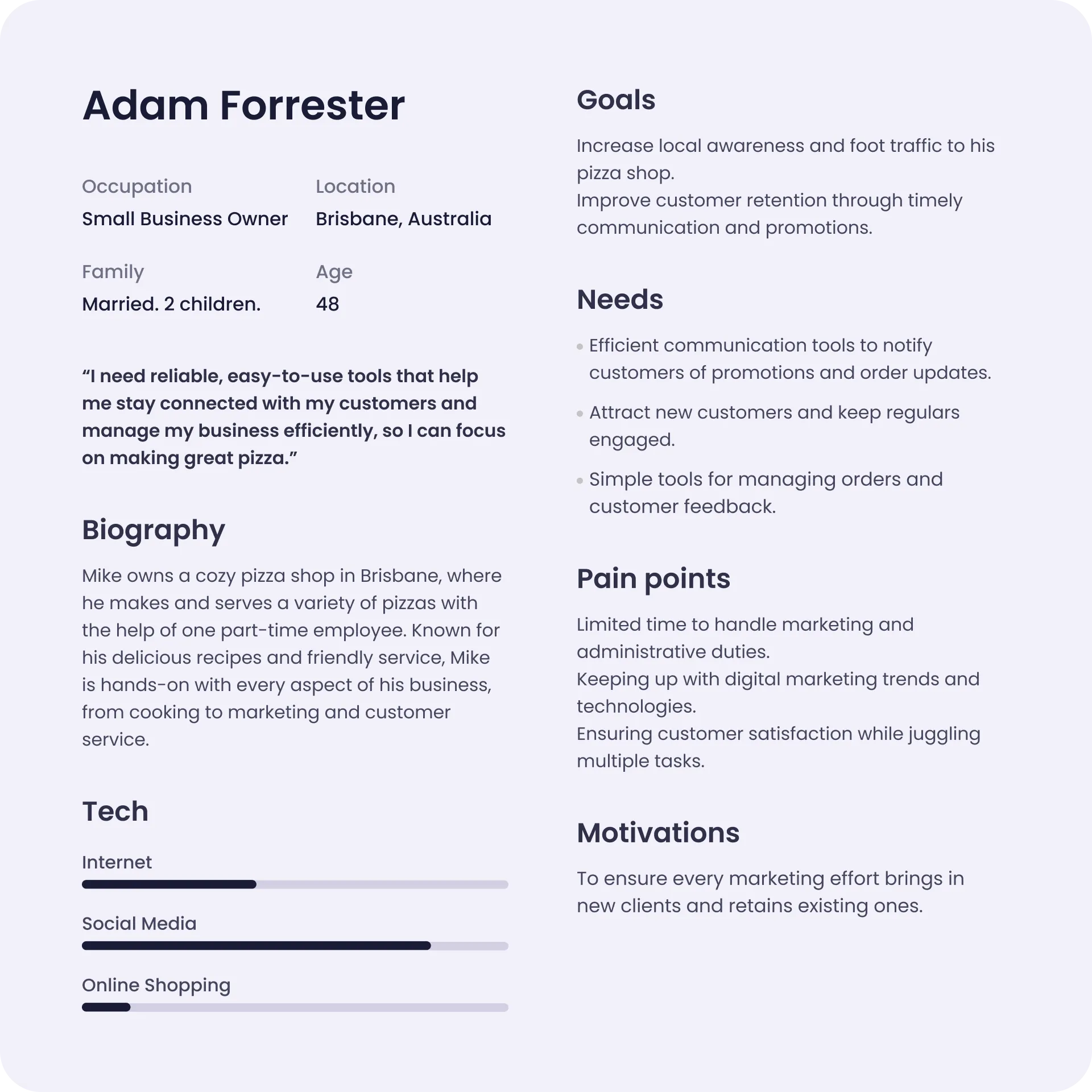
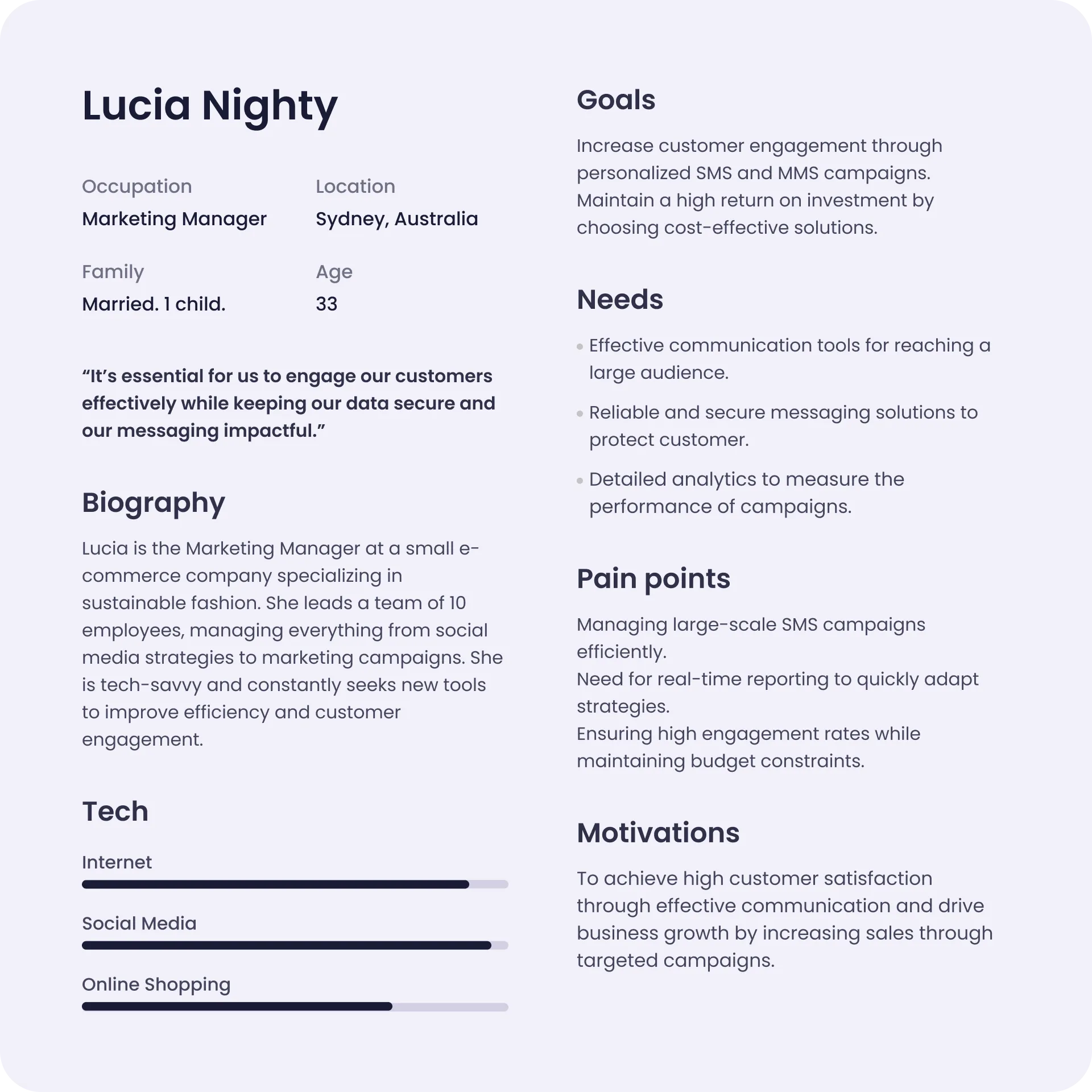
Then, I developed two personas from this work, representing the audience split Cellcast needed to design for: the customer base it had, and the one it wanted to grow into.
Heatmap analysis findings
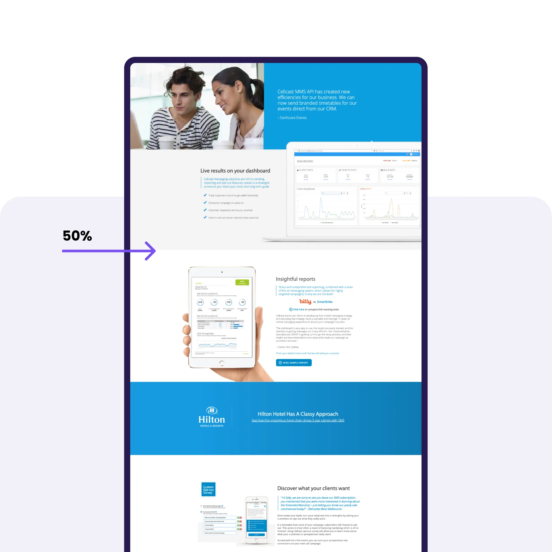
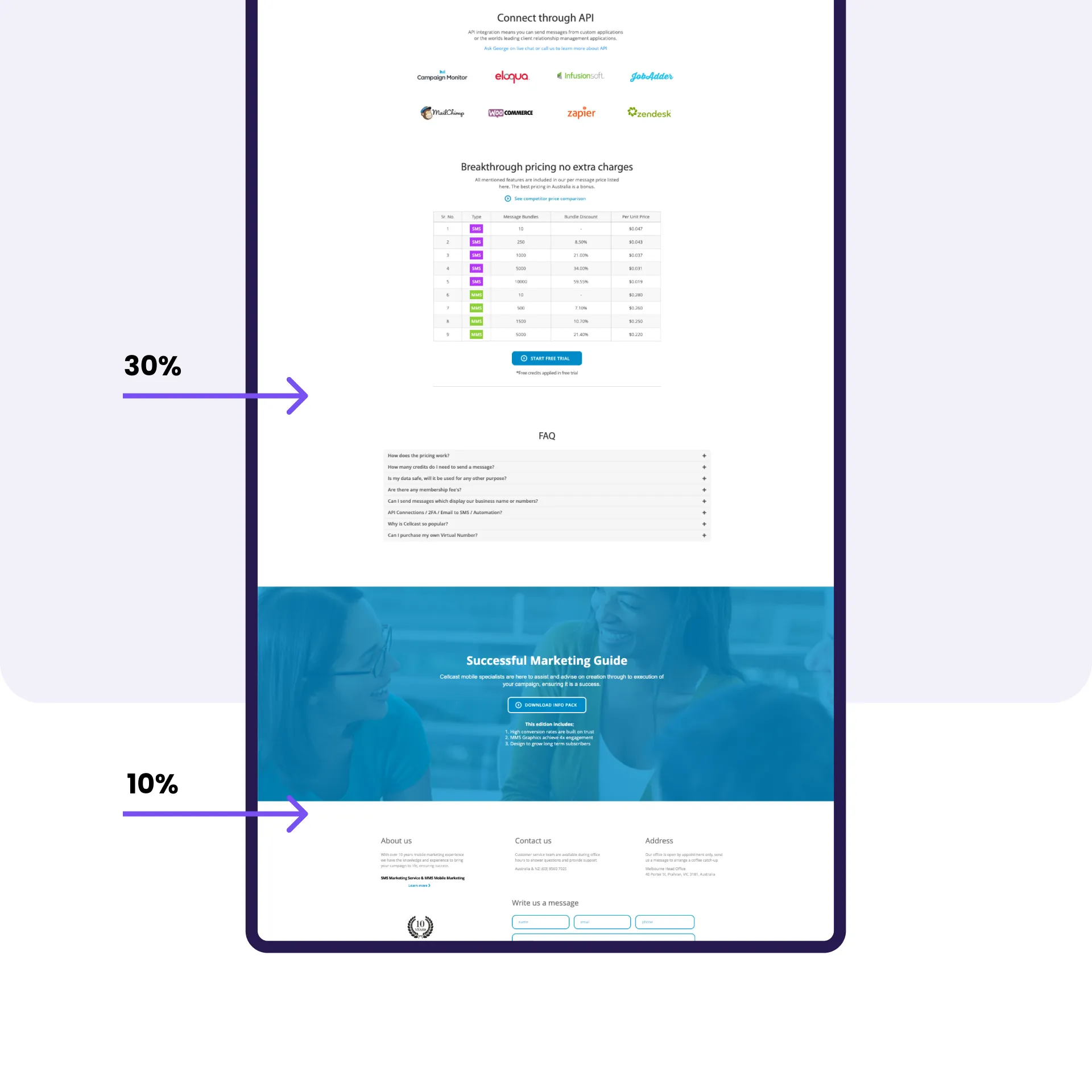
Analysing over 3 years of click heatmap and scroll recording data from the existing site, users were found to consistently prioritise pricing information, product inclusions, and competitive comparisons over other content.
This became a key input into how content was prioritised and sequenced across the new page templates.

Understanding the user journey
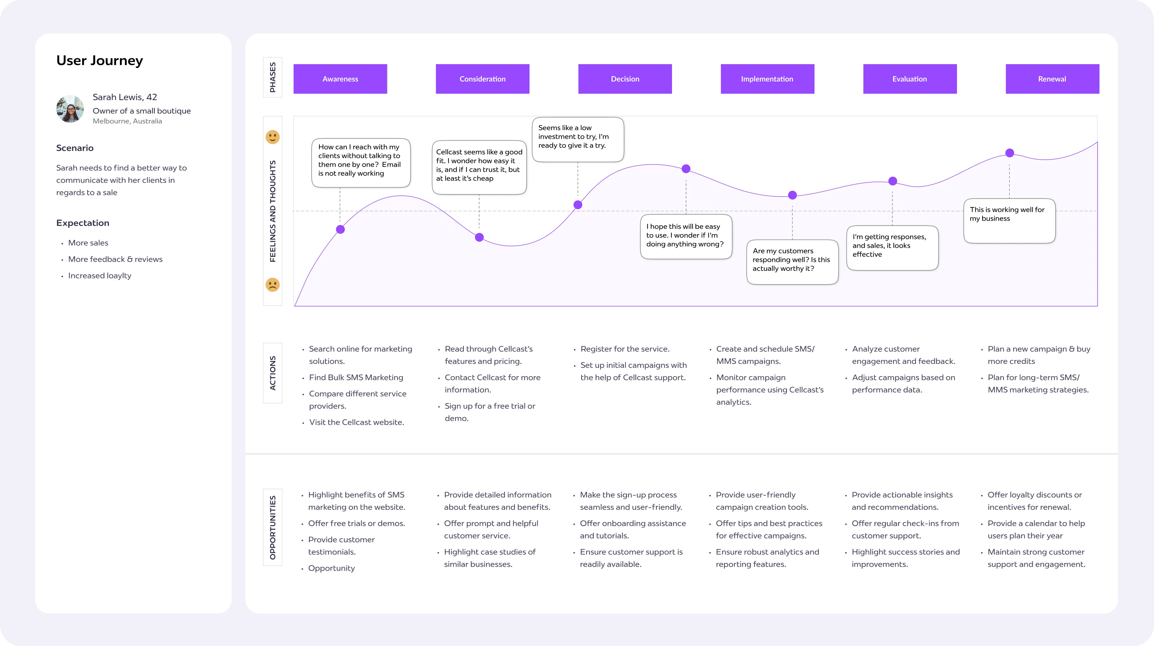
A user journey map was developed across six stages, from Awareness through to Renewal, tracing a business owner's path from an initial symptom-based search through to becoming a repeat customer planning future campaigns.
Mapping the journey this way surfaced specific, actionable opportunities at each stage, most notably the Consideration stage needed to establish trust and affordability early, and the Decision stage needed a genuinely low-friction sign-up flow rather than relying on price alone to carry users through.
Information audit, competitor analysis and visual key
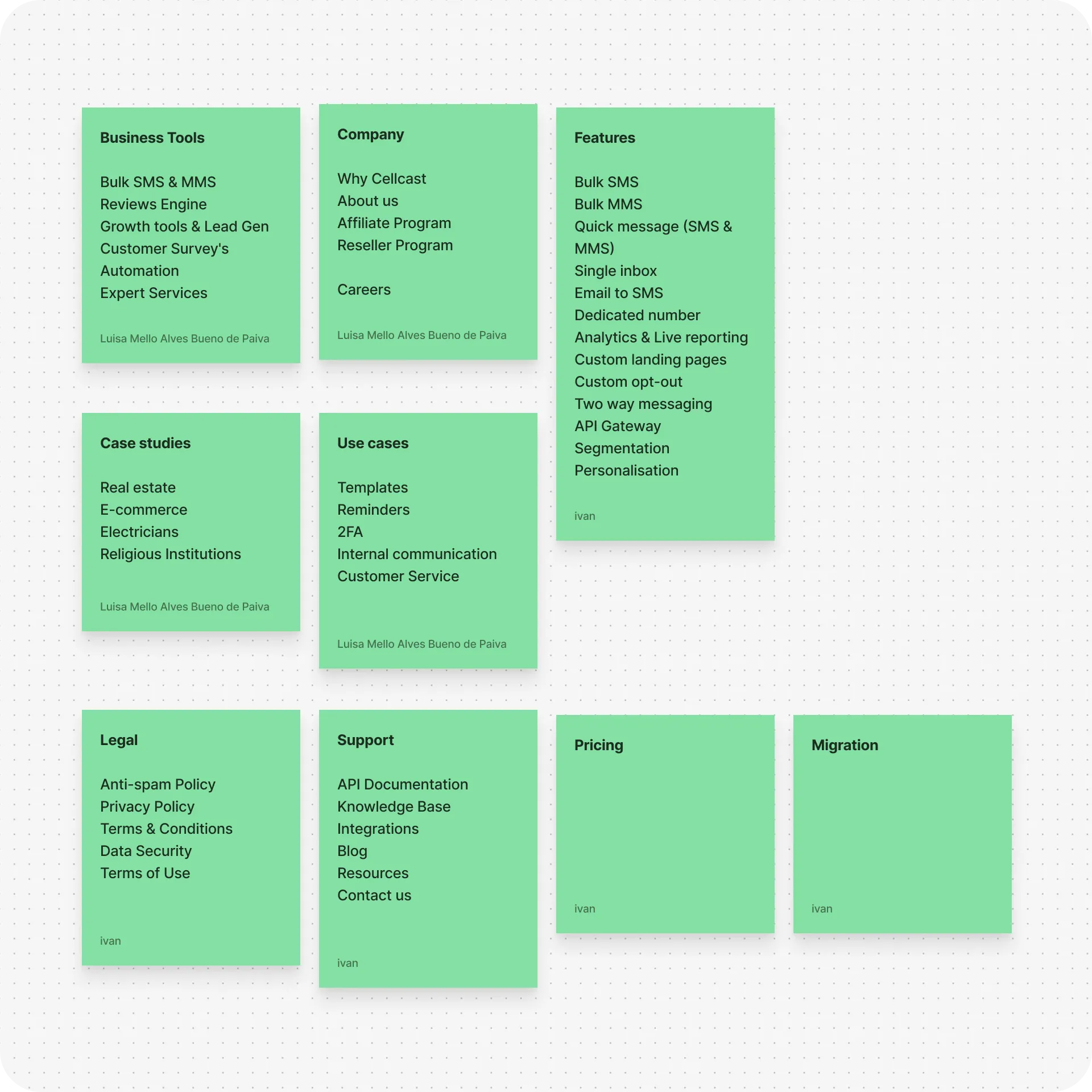
With the brief established, the first priority was restructuring the site's information architecture. I mapped out the website's current architecture and navigation, creating a sitemap and organising both existing and new pages into categories.
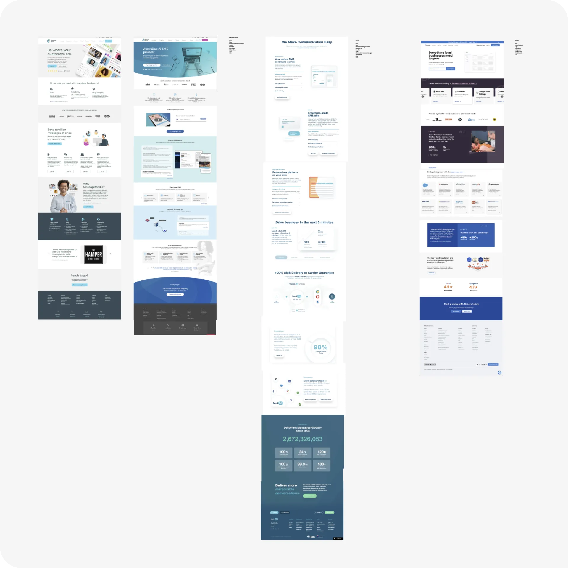
Competitors were audited to identify which content patterns were expected by users and worth retaining, versus which of Cellcast's existing sections needed to be reworked or expanded. This analysis also helped better define and evolve Cellcast's visual key, central to their new website and positioning.
I then proposed a revised sitemap version based on user needs and content strategy.


Balancing business and design requirements
Building each page individually wasn't a realistic approach within the timeline given the volume of pages.
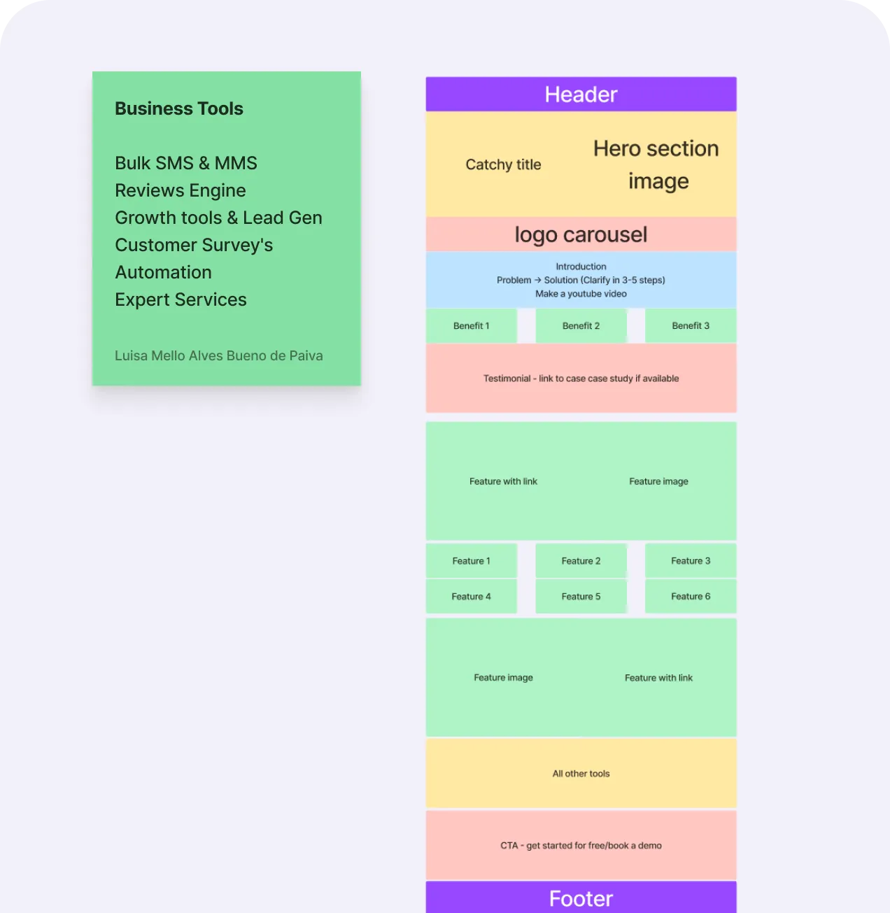
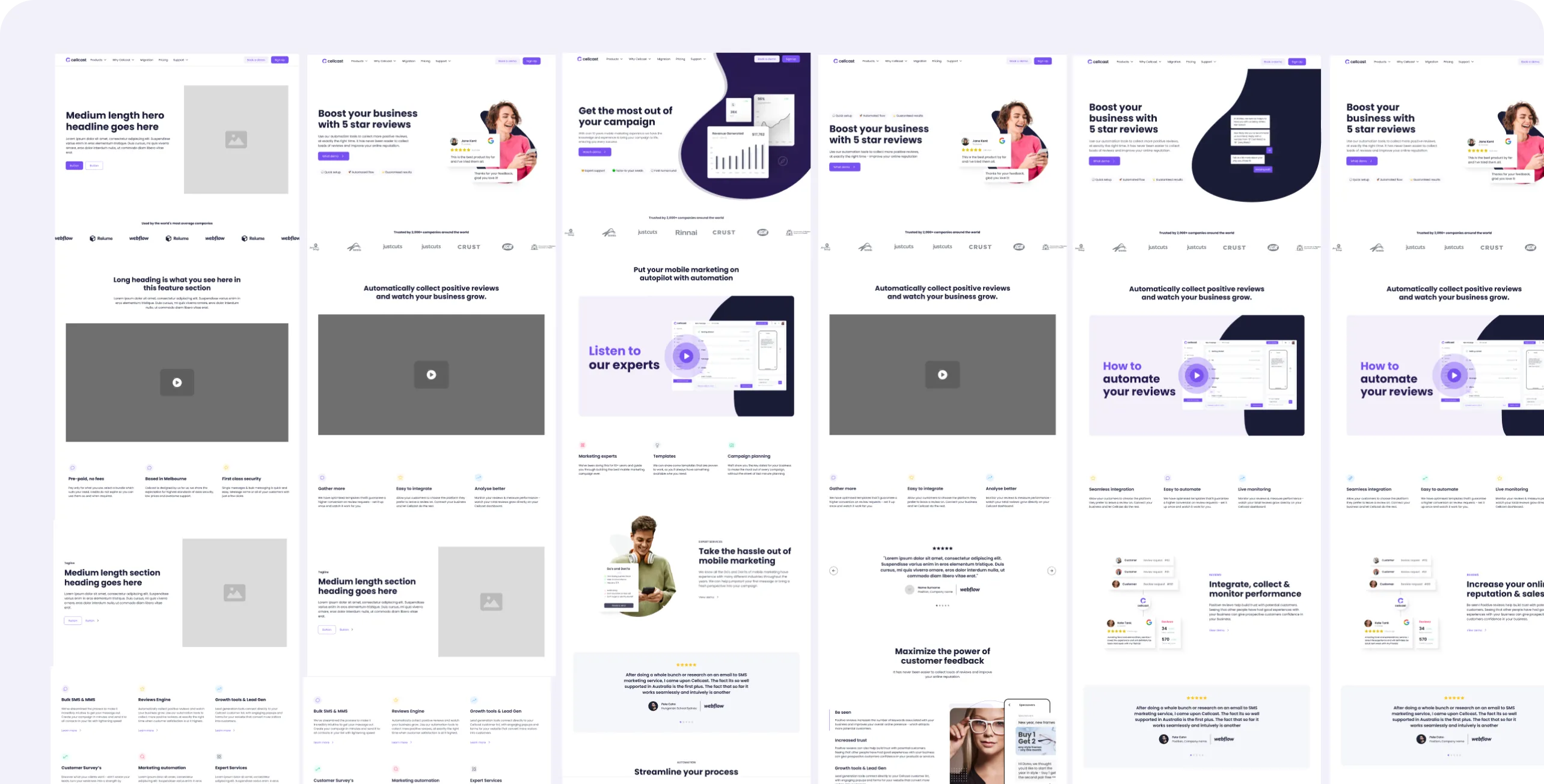
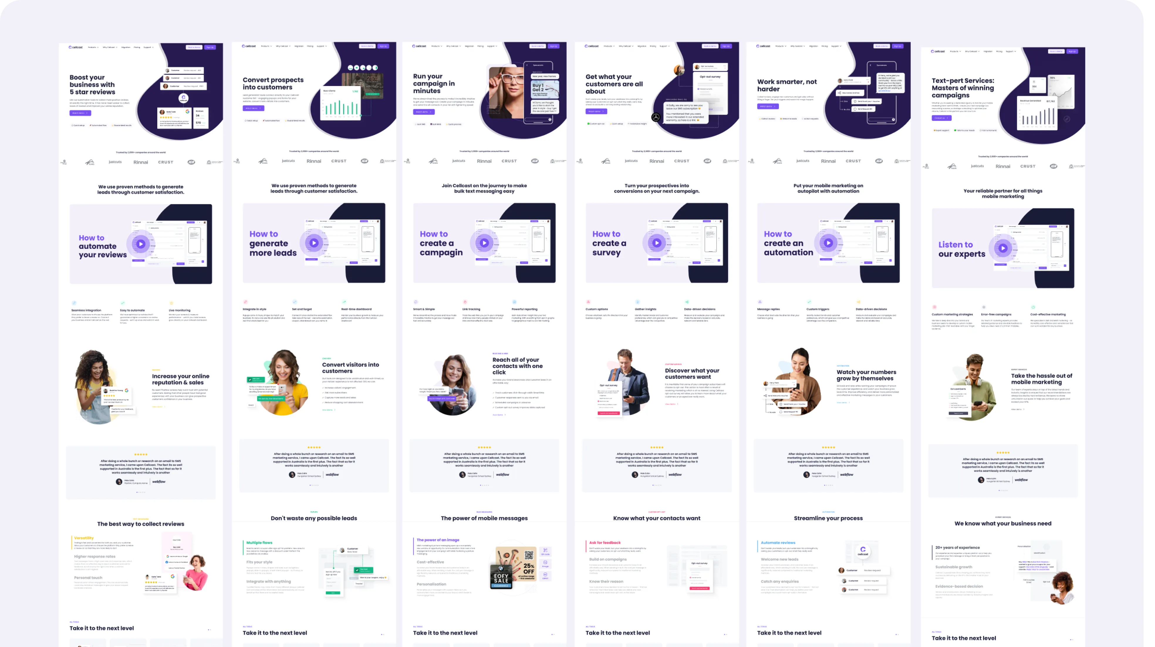
To compromise, I designed a few core page templates for business tools, features, use cases and more. These covered the layout patterns of each content type needed for over 20 pages. Every page was then populated with individual copy, colour and supporting graphics to improve differentiation between pages.
This kept the website visually and structurally consistent at scale, sped up both design and development significantly, and allowed new pages to be added later without needing a comprehensive design pass each time.
Where everything came together
The primary design constraint throughout was reconciling SEO copy requirements with readable, well-paced page layouts and ensuring pages served search performance without becoming dense or difficult to scan.
The result was a 40+ page site that gave Cellcast the space to properly represent its product range, features and pricing. A photography-led visual style introduced a more human, approachable feel to a platform that could otherwise have read as purely technical.
Generous white space established a clean visual foundation, with purple, dark navy and product-specific accent colours used deliberately to support visual hierarchy and wayfinding. Mobile navigation, previously a significant weak point, was rebuilt for usability, and blog content was restructured into clear categories for the first time.


Website development and collaboration
Handoff to development happened page by page rather than as a single batch delivery, which meant each page went through its own short feedback loop: I'd hand off a page, the developer would come back with questions or edge cases that hadn't surfaced in Figma, and we'd work through those together in review sessions before it was signed off and shown to the business. That tighter loop caught a number of implementation issues early, before they became visible to stakeholders, and kept the developer and I aligned on intent rather than just design specifications.
While granular post-launch analytics weren't made available, Cellcast reported a consistent month-on-month increase in conversion rate following launch.


Challenges and what I would have done differently
The central design tension on this project was balancing cost positioning against perceived quality. Cellcast's value proposition depends on being the most affordable option in market, so the design needed to read as polished and trustworthy without implying a price point the business doesn't compete on. There was a related challenge around category convention: much of the competitive set looks visually similar, so the goal was to feel familiar enough to build trust quickly, without disappearing into the category.
The clearer operational lesson was around process discipline. Review and approval cycles, and the degree to which copy changes affect layout, needed to be locked in earlier. Late-stage content changes, some surfacing after design sign-off and into development, made changes considerably more costly than they needed to be, and it's a sequencing issue I've learned to manage by locking in approval states and suggesting enhancements to be tracked separately.
Looking back, the clearest opportunity for iteration is the homepage itself. Its long-scroll format continues to deliver SEO value, but it no longer aligns structurally or tonally with the rest of the site, and a more focused, shorter homepage would likely communicate Cellcast's value proposition to new leads more efficiently.

Related Projects

Website refresh for an asset tracking company
